Monday, September 10, 2012

Fall Color Crush

Fall merchandise is arriving daily and we have reset the store for a fresh look and also expanded our design resource library.  There are so many things we are loving this season, especially bringing in deeper colors to compliment  your decor.   

Go Green 
We are having a green moment right now, from Jade to Moss to Teal to Chartreuse.

To Paint:
These go to greens are not only beautiful on walls, but also on built in bookcases and accent furniture.  Use a high gloss finish for a more regal effect.


Farrow & Ball Olive, #13

Farrow & Ball Cooking Apple Green, #32

Farrow & Ball Breakfast Room Green, #81
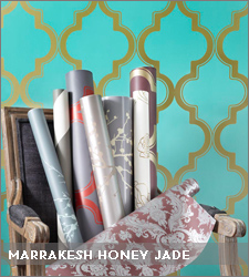
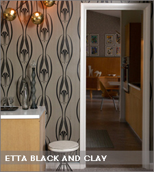
To Accent:
Choose one wall in a room and make a statement with these bold patterns.


Imperial Trellis by Schumacher


Zee Collection by Tempaper

To Decorate:
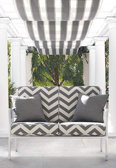
Grey and Silver accented with different shades of Green make for a striking combination.


Now in stock - pillows from acclaimed British fabric house, Designer's Guild 

Also new in store, this Green ceramic lamp ups the cool factor in any room


An easy green fix: striped green tapers from Ana Candles

Mix With:
Cobalt (our other color crush)


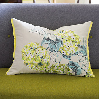
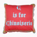
Cross stitched pillow from Designer's Guild
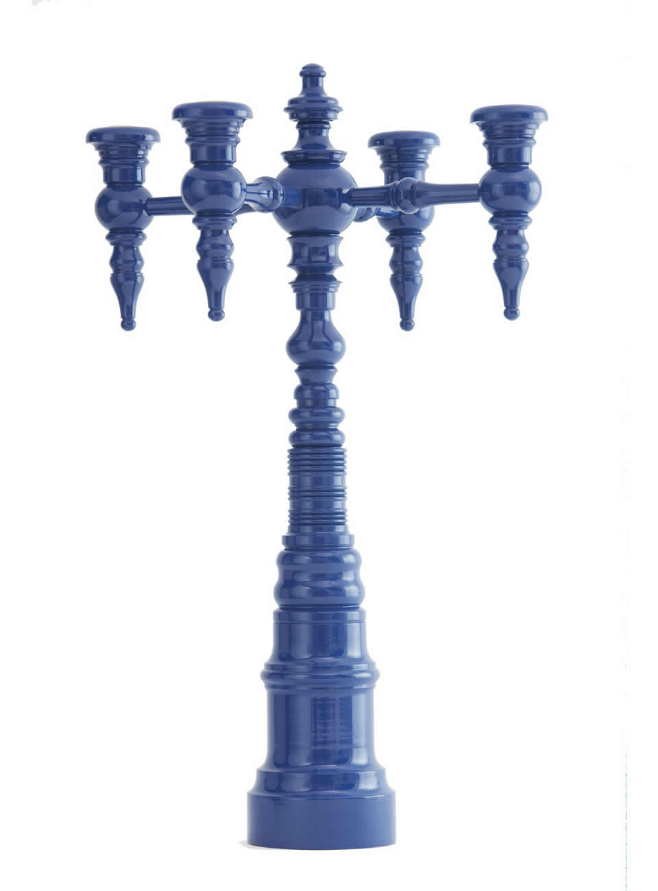
Seeing Blue
Blue is a constant in most people's homes, but this Fall it takes center stage in our minds.

To Paint:
Lacquer a piece of vintage furniture or for the not so faint of heart, kitchen cabinets.

Farrow & Ball Cooks Blue, #237

Farrow & Ball Drawing Room Blue, #253
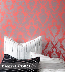
To Accent:
These classic blue patterns will never go out of style and are well worth the splurge.


Summer Palace wallpaper by Osborne & Little

Salon Velvet Stripe by Osborne & Little

To Decorate:
Black & White accents make a traditional blue palet more sophistcated and current.


Designer's Guild Pillows


Tri Color Tapers in Black & Ivory from Ana Candles


Gorgeous scented candle from Designer's Guild

There is no reason for color to hibernate all Fall and Winter.  Instead, integrate these jewel tone hues into a neutral palet to create a cheerful, yet cozy, living environment year round.


Friday, July 27, 2012

Market Musings

We recently returned from Market in Atlanta and as always it was a whirlwind trip.  However, we feel rejuvenated and inspired by all of the incredible products we saw.  The Home Accent and Gift Industry is once again thriving.  Below is a round up of some of our favorite things that we saw.

Tempaper is temporary wallpaper that is super stylish, affordable and easy to apply and remove.  You simply peel and stick.  Developed by two NYC set decorators, this was one of our best finds.  We will be getting the sample ring in, but here is a sneak preview of some of the designs:


Of course we are always drawn to color, and just because Fall and Winter are right around the corner it doesn't mean you have to "beige" out.  Worlds Away updated a best selling mirror and lamp styles by introducing this hot new color way:


We were on the hunt for accessories that would turn up the style factor in any home.  Here are some of our picks:


Note the flecks of gold in this cowhide - how glam is this?!
It's always so much fun to see the brand new lines that have come out.  The one we were oohing and ahhing over the most was Dunes & Duchess.  We had the privilege of meeting one of the designers, Stacy Kunstel, and she showed all of their wonderful designs to us.  High gloss lacquer, bright colors, an over scale size and made in the USA are what makes Dunes & Duchess stand apart:


The fun of buying for 4th Quarter lies in uncovering unique items that are not only fun to receive, but also give.  We were quite pleased with our findings but will share only a few with you - we want to tantalize your senses come November when it's time for your full fledged holiday shopping!


Tons of new products including jewelry, gifts and home décor will be arriving beginning in September.  Make sure to keep up with us on our facebook page to see all the latest goods.  www.facebook.com/adelelexington


Wednesday, July 11, 2012

Meet the Designer: Jane Pope from BALBOA Jewelry

Jewelry Designer Jane Pope Cooper is known for the vintage yet classic combinations she puts together in her BALBOA line.  Simple and stylish, Jane's designs can transform an everyday outfit into a "WOW" ensemble.  Her timeless pieces can be worn for years to come.  We recently caught up with the busy soon to be mother of two:

Name: Jane Pope Cooper

Occupation & Company:  designer BALBOA Jewelry and Jane Pope Collection

Years in business: 11

City:
We just relocated to Spartanburg, SC…
I have taken this business from Charlotte, NC to Los Angeles to Charleston, SC to NYC to DC and now landed back in SC. 

Tell us a little about your work: 
I have two collections.  Balboa jewelry is my costume line and contains vintage elements reworked for a more modern feel. 
My Jane Pope Collection is fine jewelry.  I use mostly 14 kt yellow, rose and white gold, but I have recently introduced Silver.  I love mixing metals and textures to give simple pieces more interest.

What makes your products stand out:
Since the Balboa line contains vintage elements, each piece is limited to re-production and are often one-of-a-kind.  This keeps things fresh and new!  Although I can make a version of something again, there may never be an exact replica.  Everyone likes to feel special and unique. Having a one-of a-a-kind piece certainly helps make you feel confident that you will not run into someone in the same look.

Describe your style in 3 words:
Can’t Be Described - ha!
I don’t know if I can classify my own style.  I love patterns and neutrals, modern and classic, bold and simple, feminine and tailored.... mixed together of course!  Eclectic is such an overused word, but it fits I guess. 
  
What inspires you:
I find inspiration in everything around me.  It can be something simple and at first glance mundane that sparks a creative energy… a texture of something, a fabric, a color combination, photography, travel. 

What is your current favorite trend:
I am bad about following trends in my own style. I feel that mixing more trend strong pieces with classic ones creates a more authentic picture of your style.  Right now, I am 38 weeks pregnant, so my favorite trend is anything that makes me look less gargantuan… I am wearing a lot of fitted dresses.  Showing off the bump works better for my body than draping too much fabric over it.   I look forward to working texture and volume back into my wardrobe this Fall!  I have been working with less is more for the past 9 months.  I am anxious to mix things up a bit post baby!


BALBOA Jewelry can be found exclusively in Lexington at Adelé.  Thanks to Jane for her time!


Saturday, June 23, 2012

Fresh Fabrics

There are so many inspiring fabric collections out right now and new samples are arriving daily.  Whether you are redecorating an entire room or just need to freshen up an old couch with new pillows, we wanted to share some of our favorites with you.

John Robshaw for Duralee

Textile Designer John Robshaw's signature look is an updated spin on the exotic, handmade object combined with a vibrant mix of sophistication and romantic allure.  His recently launched collection with Duralee Fabrics includes bold patterns that are dyed, printed, woven and stitched.


Howard Hodgkin for Designers Guild

British painter Howard Hodgkin is best known for his abstract works.  His collection with venerable design house Designers Guild is abstract, textural and vibrantly colored.  These painted fabrics are printed on linen and cotton.


Cote d'Azur Indoor-Outdoor Collection for Schumacher

The color palette of this collection is inspired by the sand and sea: chic neutral shades of driftwood, grey, and oyster layer with watery hues of turquoise, pool, and navy. A mix of bold and graphic patterns blend with velvet, chenille, and matelassé weaves, providing enduring luxury and drama for a wide range of environments.


Saturday, June 9, 2012

In Living Color

With all of the exciting color combinations in fashion this season, we are loving how this look is being translated to home decor as well.  No more "blah" rooms, instead, bright and vibrant spaces that are cheerful to be in. 


From the May cover of Southern Living.  Why we love it: The white tufted sofa and settee are brought to life with the colorful fabrics chosen for this room.  The citrus color pallet of pinks, tangerine, citron yellow and aqua all come together to bring the basics to life.  Side note: if you haven't checked out this magazine in a while, give it a try.  The fresh content is inspiring - it's definitely not your mother's Southern Living.


We enjoyed so many of the design elements in the House Beautiful feature of this prewar apartment designed by Christina Murphy.  However, our absolute favorite room was the family room.  Why we love it: today's go-to neutral, grey, was brought to life with a pallet of blues and greens.  The emerald green velvet sofa is the star of this show and this bold color is repeated in small details throughout: from the pattern on the chair, to the trim on the roman shades, to the flowers on the mantle.  For the traditionalist, this room is a perfect example of how to twist up your design a bit, but still stay true to your roots.


This space designed by Miles Redd is definitely not for the faint of heart, which is exactly the reason we are so enamored with it.  Why we love it: blue lacquer walls, pops of red, black & white accents - this foyer screams sophistication.  It's bold & brash, but in a good way.  Even if you just took away one inspiration from this room, you could liven up your space.  Try painting a pair of doors high gloss black to create drama in your entry way.  Or paint a console in this striking blue and add bright red pagoda lamps.  Hang a white lacquer starburst mirror above and you've got instant drama.